
Banner ads are perhaps one of the most ubiquitous features of a website – something that we all take for granted. Probably the only time we really notice them is when they become really loud and aggressive and dominate the webpage, eating up space reserved for valuable, unique, contextual content. Then they become a nuisance, a disturbance, relegated to the lowest rungs of the internet content hierarchy – clickbait. In many cases, banner ads willingly accept this role, popping up at times when you least expect them to and refusing to back away into the background. The typical user strategy is to install an ad block extension on the browser and just forget about it.
From one point of view, the webpage is nothing but a collection of blank banners. A banner is nothing but a frame – a rectangular space reserved for your content. You can break down the space in a webpage as a collection of banners. The use of webpages as advertising real estate has been happening since the 1980s, but the term ‘banner ad’ was first used by a company called HotWired in 1994. HotWired specialised in making and selling banner ads in large quantities for corporate advertisers.
Soon, with the commercialization of the internet, advertisers pounced on these newfound adspaces, and banner ads became their ubiquitous self that we know now. It is certain that banner ads are not going away, but is there a way of reinventing them so that they don’t cause heartburn and irritation for the user? Is there a way to turn the banner ads around and actually make them engaging? Here are a few tips that will help you get there.
How to Make Your Ecommerce Banner Ads Better
1. Standard Sizes
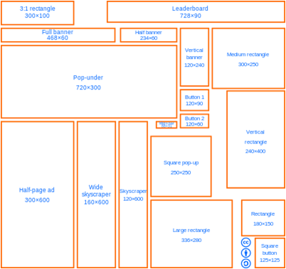
According to Kenneth Sytian of Sytian Productions and Outsource Website Design Philippines, banner ads are generally designed to be placed at prominent positions on your website. Unless you have the power to completely customise a website’s design, it doesn’t make much sense to make banner ads in non-standard sizes. The whole point about a banner ad is that it can be placed on any webpage you want, much like the actual physical banners and billboards that we see in the cityscape. The Interactive Advertising Bureau is a business organisation that develops industry standards for the online advertising industry.
Check out the image to see the different standard sizes that you can use to make your banner ad. In web design, we generally measure space in pixels, and some of the most common banner ad sizes are 728 x 90 px (Leaderboard), 300 x 250 px (medium rectangle) or 300 x 100 px (mobile banner). A good rule of thumb to keep in mind is that 100 pixels are approximately equal to 1 inch.
2. Responsive Design

Responsive design is a design philosophy and outlook that advocates that the web design should respond to, fit according to, accommodate, the size of the interface on which the website is being seen. Since the designer does not have control over what that interface might be – it might be a desktop, laptop, mobile device, each with a unique screen size – the designer has to make sure that the content does not get distorted or cut off due to the screen.
Responsive design is extremely important in the way we use the internet today because we are used to shifting from device to device, expecting a certain continuity in experience – not just in terms of content, but also in terms of the feel of the website. Static, unresponsive banner ads designed for the desktop can be a nuisance when they are opened on a mobile device. So think about which devices you are making this ad for, and try to go responsive as much as possible. Here are some ecommerce landing page examples.
3. Make it Interactive (But Forget Flash)
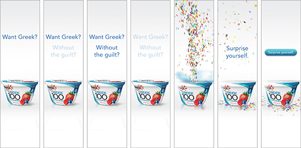
It is our natural tendency to focus on movement, so an animated banner ad instantly captures the viewer’s attention. There are although a few pointers to keep in mind while doing so. Firstly, you have to make sure that the ad is light enough to load. It is a rookie mistake to go all out in creating a banner ad with extremely complex graphics that doesn’t load properly.
Secondly, don’t overdo it. Sometimes subtle animation is more than enough to convey your message. The animation can even be user-responsive, for example, a static image can start animating once the cursor passes over it. Finally, it is time we move on from Flash once and for all. Most web browsers have either already stopped extending Flash support or are planning to do so in the near future. It is time to switch to html5 instead, for smoother transitions and better web support.
4. Get the Branding Right

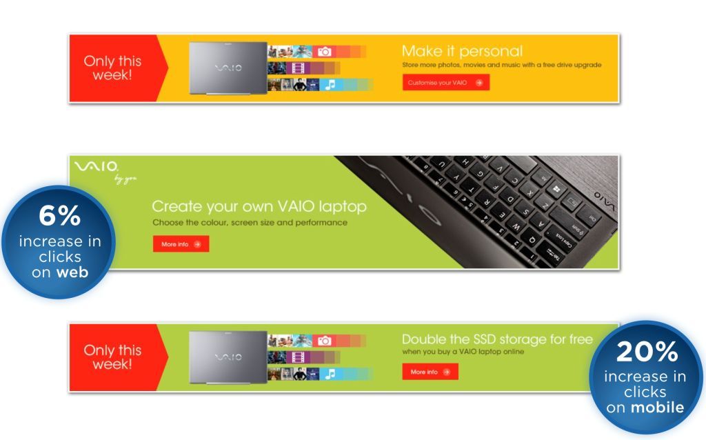
You should not forget that at the end of the day, that the banner ad is first and foremost an advertisement. It is important to keep the look, feel and tone of the banner in sync with the rest of your ad campaign, while making sure that it is attractive and engaging. Work with a designer and a copywriter so that your banner ad looks and reads well. This way, you will be able to attract more customers and make the most of your banner ad.
5. Call to Action

The banner ad is specifically used to incite the customer into action. While it can be creatively used to provide information about the product or the brand, its key function is that it is a clickable ad that takes the customer to the selling space. Therefore, it is vital that you craft a persuasive call to action with your banner ad. Remember that the secret to a good call to action is not just in the copy, but also in the typography, design and placement on the banner. By utilising a succinct and to-the-point CTA, you can make sure that your banner ad is unambiguous and inviting. Remember to link your CTA to an effective landing page.
This is what we have on making your banner ads better. To know more, get in touch with Browntape. We are India’s leading ecommerce solution providers, and we are always happy to help!