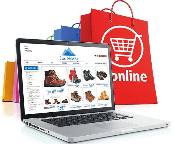
Perhaps the greatest hurdle in the transition of a consumer from an offline shopper to an online shopper is the tendency to try a product before buying it. Indian consumers, especially from the up-and-coming tier II and III cities are used to checking a product out in showrooms before buying it. This is especially true for the two most popular categories in online retail – electronics and apparel. This is probably the reason why online retail platforms like Flipkart are mulling over the option of establishing offline stores in various parts of India.
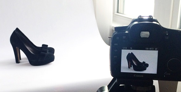
Be that as it may, there are a few things that you can do as an online retailer to make your customers more comfortable while shopping on your webstore. The most important factor to work with here is product images. Imagine a website without a product image – how would the user imagine a product if all the information about it is in the form of text – however detailed. The image is what primarily fuels the imagination so that the user already has an idea of what is in the box before opening it.
A good image faithfully brings out the different qualities of the product – its colour, texture, size, etc. without misleading the viewer. It also makes the viewer comfortable with the idea of the product – the viewer can imagine themselves wearing the article of clothing, or they can mentally place a product in their living room to see how it might look. Since the image is such an important factor in making a sale, we should spend some time on thinking about what makes a good image for a product listing on an online retail website. Here are a few important points.
Tips for Product Images for Your Webstore
1. High-Resolution Images
Uploading high-resolution images is the first factor for a good product image for your online retail store. Hi-res images are heavier files, but that is because they are simply made up of more pixels – they pack more information about the product. You can provide the viewer with an option to zoom in and investigate the product more closely through a hi-res image. This way the look and feel of the image is captured through the texture and the patterns on the product, giving your viewer more visual information about it.
2. Use Multiple Images
This is an important point which many online sellers miss out on. It is vital to put at least three images of your product, preferably more. Use different camera angles to showcase your product from different sides. It is always nice to have an image showing the product in action, so if it is a backpack or a suitcase, add an image where it is full of books/laptop or clothes. This is also good to display the various features of the product, like the number of pockets or compartments the backpack has. The more information your images provide about the product on a standalone basis, the better.
3. Thumbnails/Quick View Images
Thumbnails are literally the first time the viewer lays eyes upon your product. So make sure that it is present. Many websites offer a quick view option where a small size image pop-up is utilised. You can convert your hi-res images into thumbnail and low-res sizes and use the same for these purposes. Just be careful while doing so, because some images that work great in hi-res might not be the best when scaled down. Understand the function that different image sizes perform and choose your images accordingly.
4. Don’t Overdo Post-Production
Post-production of images is a necessity. Even if you use good quality equipment to capture your photos, you will need to put them through a photo editor like Photoshop and make sure that they are composed properly, adjust basic brightness, contrast and colour settings, remove certain defects and align them properly. While this is important, don’t go overboard with the touch-ups. Digital technology gives us unlimited control over manipulating an image. The product image must do justice to the product. It is a bummer for the customer if they realise that the actual product looks nothing like its online image, and it could get you in some trouble.
5. Design Your Website Accordingly
If you are planning to showcase your images on a standalone website, then you have total control over how they are displayed. For example, you can use various tactics of responsive design to help the user toggle between a normal and a magnified view of the image. The same goes for scrolling between images and pop-ups. Try to remove unwanted images from the website surface so that the viewer’s attention is focused on what you want them to see.
This is what we have on product images for your online retail store. To know more, get in touch with Browntape. We are India’s leading e-commerce experts, and we are always happy to help!


