When selling online what’s the first thing a consumer notices?
It’s your product’s images. This is the only way a consumer can be sure of what he’s buying. A product image is your first and last shot at making an impression. That is why you need to make every image count.
Unlike at a physical store, consumers cannot touch and feel your products. So the next best thing is offering product images to illustrate the look and feel of your goods. We’ve already brought you tips on how to enhance your sales with good photography and when it’s the right time to call in the photography specialists.
But what if you’re on a tight budget or your professional images keep getting rejected by your marketplace? To help you out in this respect, we decided to bring you the product image guidelines you must be aware of for effective online retail.
Sharp images with a clear perspective
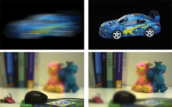
Like you already know a consumer only has an image to go by. So that image has to be crystal clear. Avoid uploading blurry pictures or images of low quality. Flawless sharp images are what you should be striving for. In terms of perspective, make it a point to have your main product as the star of the image. So arrange it in a way that will get all of your consumer’s attention as they access your ecommerce website or online store.
White background images without distractions
If you’ve noticed, many of the products sold on online marketplaces have a simple white background with zero distractions like logos, watermarks, text, etc behind the product. This ensures consumers only focus on your products. White backgrounds make a product look more realistic. And, the consumer can picture the way in will use it and the settings in which he will use the product.
One product at a time
Avoid making a collage of your products in one image. You have the option to show multiple images. So make sure each one (image) displays the appearance of a single product at a time. Even if you plan on selling combos make it a point to show consumers what each of the product in the combo looks like. This way you can avoid returns too. Consumers will not buy a combo if they have seen exactly what it contains and don’t like those products.
Follow the 80% rule
Make sure at least 80% of the image you upload shows off the product you are selling. This way the consumer cannot miss the details of your commodities. At the same time, make sure you maintain proportionate margins on all the sides of the product image.
Quick tips
You can make the best of your product images by remembering just a few simple tips. These will ensure your products get the attention they deserve and the orders you’ve been looking for.
A – Take shots from different angles – This way consumers can see everything about the product from all the essential angels. This can also help avoid product returns.
B – Photograph special features – Make your product’s special features known through images. If your product has something new and special about it make sure it is demonstrated through your product images.
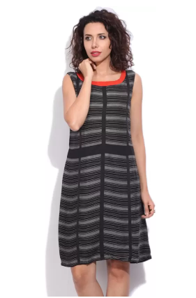
C – Use models where necessary – Like for earrings, clothes, bags and other wearable items. This way, consumers can judge the size of the product.
D – Post attractive pictures – Make sure the model poses are attractive and not awkward and uncomfortable to look at. The same goes for the arrangement of the products without models.
E – Provide zoomed in shots – This will allow consumers to inspect the product closely and make their decisions effectively.
It is advisable to get a professional to help you out with product images. However, you can still take classy images by yourself and edit them effectively to make a positive impact on your audience. For more assistance with product images connect with us at Browntape. We are India’s leading ecommerce experts and we are always ready to help!


